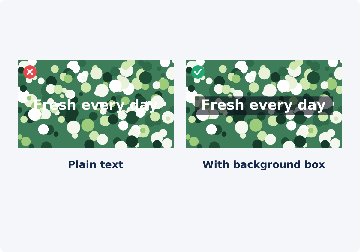
Contrast changes with the footage
Contrast is the difference in brightness between the text and whatever is behind it. On a web page, the background is one color and you choose it. On video, the background is a moving picture. During a five-second text layer, the camera may pan from a shaded wall to a bright window, a person may walk behind the words, or the scene may cut.
Text is drawn over a picture that keeps changing. So the question is not “does white work here?” but “does it work on the brightest and darkest frame in this layer’s range?”
White and near-black are the most dependable text colors because they sit at the ends of the brightness scale. If brand colors lose contrast against the footage, use them for the box and keep the letters white or dark.
Size, line length, line spacing, and wording
Font size
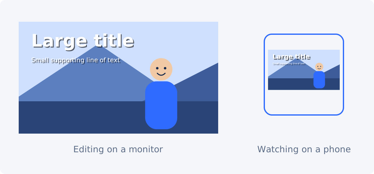
Most video is watched on phones, where the whole frame may be only a few inches wide. Text that looks comfortable on your editing monitor can be tiny there. The Font size field accepts values from 12 to 160. For anything the viewer must read, stay in the upper part of what your layout allows, and judge the result at phone size, as described later in this guide.
Line length
Short lines are read in one glance. Aim for roughly 20 to 35 characters per line and no more than two or three lines per layer. Split longer messages across consecutive layers.
Line spacing
Line spacing is the vertical distance between lines in the same layer. If it is too tight, lines merge into a block. If it is too loose, they stop looking like one message. Adjust the Line spacing field until the gap between lines is clearly smaller than the gap between this text and anything else on screen.
Concise wording
Every word you remove lets the rest be larger. “Always let the dough rest for at least thirty minutes before shaping” becomes “Rest the dough 30 min.” Let narration carry the nuance and on-screen text carry the point.
Font choice
Choose sturdy letterforms. Thin, condensed, and script typefaces lose their fine strokes when the video is compressed. The tool offers a Font list, and Arial serves as the fallback if a chosen font is unavailable during processing.
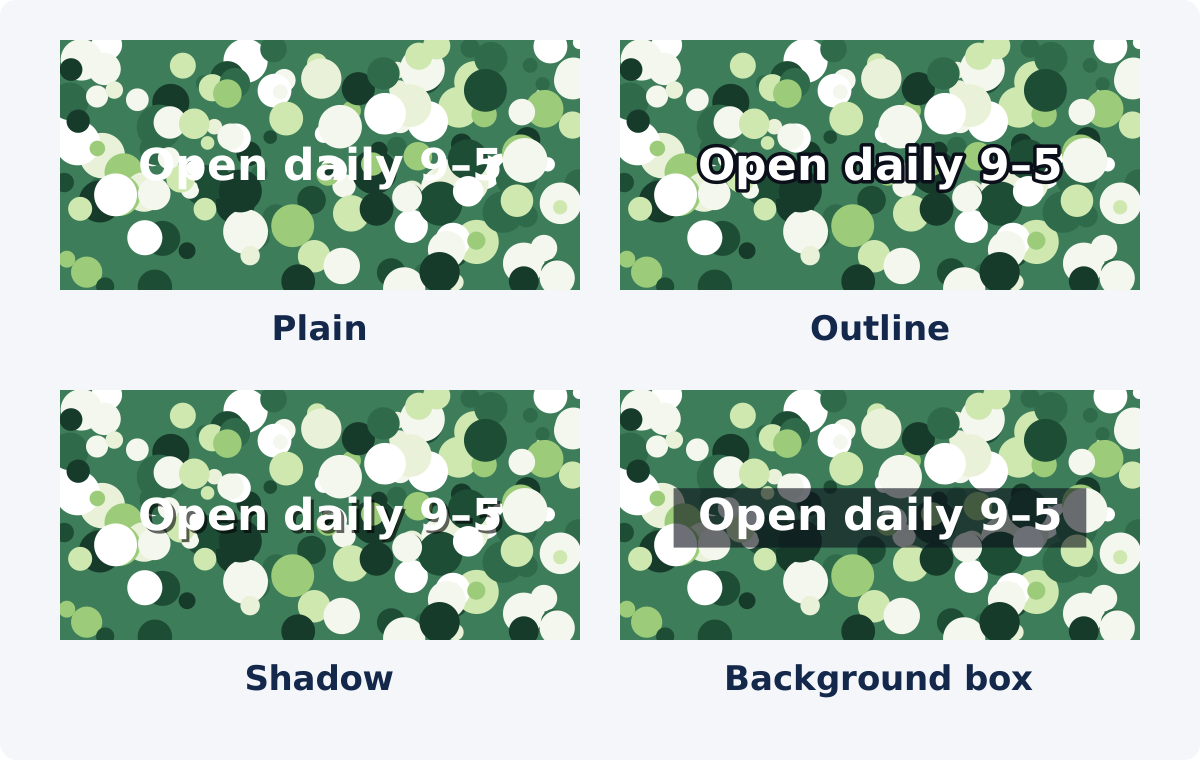
Outline, shadow, or semi-transparent box
These tools put a controlled layer of contrast between the letters and the footage.
Outline
An outline is a line drawn around each letter. In the tool, it is set with Border width and Border color. A dark outline around white text guarantees a dark edge next to every letter, whatever the footage does. It is compact and leaves the picture visible. The tradeoff is that thick outlines clog the openings in letters such as "e" and "a," especially at small sizes, and the look can feel dated. Keep the width small in relation to the font size.
Shadow
A shadow is a copy of the text drawn behind it at an offset. Shadow X and Shadow Y set the horizontal and vertical offset, and Shadow color and Shadow opacity set its look. A shadow is the subtlest option and suits clean, modern titles. The tradeoff is that it darkens only one side of each letter, so over a busy or very bright background it may not be enough by itself.
Background box
A background box is a filled rectangle behind the text. Set Box to On, then choose Box color and Box opacity. Box border width controls how far the box extends beyond the letters. The box is the most reliable option, because the text always sits on a surface you control. The tradeoff is that it covers more of the picture and changes the look of the frame.
Combining them
The settings are independent, so you can combine them, for example a light shadow on text inside a box. Start with one tool and add a second only if a test frame still fails.
Text opacity and box opacity
Opacity is how solid something is, from fully transparent to fully solid. The tool has two separate opacity settings, and they should be treated very differently.
Text opacity affects the letters. Lowering it lets the footage show through the text itself, which reduces contrast. Keep it at full strength for anything that must be read. Reduced text opacity is for decorative or watermark-style text only.
Box opacity affects the background box. This is the control to tune. A low value keeps the footage visible but may not calm a busy background. A high value approaches a solid bar. The presets give a sense of the useful range: Title uses 0.38, Caption 0.46, and Label 0.8. Test on the brightest frame in the layer's range, because that is where a dark, semi-transparent box is weakest.
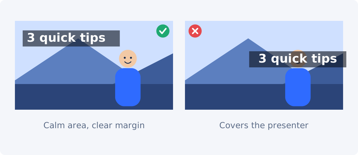
Placement: away from faces, products, logos, and edges
- Faces. Viewers look at faces first. Text over a face hides the most important part of the frame and is hard to read against skin tones and movement.
- Products and demonstrations. If the video shows an object or an action, the text belongs beside it, not on it.
- Logos and existing graphics. Text that touches a logo or a burned-in caption makes both harder to read. Leave clear space between them.
- Frame edges. The safe area is the central part of the frame where content is unlikely to be cropped or hidden by an app's interface. Platforms overlay buttons, usernames, and progress bars, and their layouts differ and change. The tool does not mark safe zones. Keep a visible margin on all sides, and check a test upload on your target platform when placement is critical.
- Calm areas. Sky, walls, floors, tabletops, and out-of-focus backgrounds are natural homes for text, because they vary less from frame to frame.
How to style readable text in Deus.Video
In the Add Text to Video tool, you can add text to a video online and set every readability control on each layer. A text layer is a separate piece of text with its own wording, style, position, and timing.
- Upload the video and select the sample text layer, or type new wording and click Add text to create a layer.
- Enter short wording in the Text field. Text is typed by hand.
- Choose Font and Font size, and adjust Line spacing if the layer has more than one line.
- Set Text color to white or a dark tone, and leave Text opacity at 1.
- Add separation. Set Border width and Border color for an outline, the Shadow fields for a shadow, or Box, Box color, and Box opacity for a background box.
- Drag the layer to a calm area, away from faces and edges.
- Set Start and End, then move the playhead through the whole range and watch the text against the changing footage.
- Click Add text to video to process the file, then download it.
- Review the download on a phone.

Problems and the controls that fix them
| Background problem | Useful control | Tradeoff |
|---|---|---|
| Bright sky or white wall behind white text | Switch to dark text, or add a dark box | Dark text fails if the scene later turns dark |
| Busy background such as foliage, crowds, or patterns | Background box with medium to high opacity | Covers part of the picture |
| Background brightness changes during the layer | Box, or white text with a dark outline | Outline can look heavy at small sizes |
| Text looks slightly washed out over mid-tones | Shadow with moderate opacity | Too subtle for busy footage |
| Text color is close to colors in the footage | Change Text color to white or near-black | Less room for brand color in the letters |
| Text crosses a face or a moving subject | Move the layer, or shorten its time range | The position may be less prominent |
| Text is unreadable at phone size | Larger Font size and fewer words | Less information per layer |
| Lines of a multi-line layer run together | Increase Line spacing | The layer takes more vertical space |
Mobile-size review and whole-range preview
Check at phone size
While editing, step back from the monitor, or shrink the browser window until the preview is about the width of a phone. If you have to lean in, the text is too small. After processing, send the downloaded file to a real phone and watch it at arm's length, in normal room light, with the screen at normal brightness.
Check the whole range
For each layer, look at its first frame, its last frame, and the brightest and darkest moments in between. Text that is readable for four seconds and lost for one still fails, because viewers cannot choose when to read.
Check the processed file
The processed video is encoded again, and platforms compress uploads further. Compression softens thin strokes and small text first. If the text looks fragile in the download, make it larger or heavier before you publish.
Accessibility principles
- Aim for strong brightness contrast. The W3C's Web Content Accessibility Guidelines explanation describes a contrast ratio of at least 4.5:1 for regular text and 3:1 for large text on web pages. Video backgrounds move, so a single ratio cannot be measured the same way, but the numbers are a useful reference when you choose a text color and a box color.
- Do not rely on color alone. If red text means "warning," add the word "Warning" too.
- Give people time. Keep text on screen long enough to be read without rushing. The tool does not calculate reading time, so set the range by hand and be generous.
- Keep important information out of decorative text. Low-opacity, stylized, or rotated text is for atmosphere, not for facts.
These are good practices, not a compliance statement. Following them does not by itself make a video meet any accessibility standard or legal requirement. On-screen text is also not a substitute for captions of spoken dialogue. For longer timed dialogue, see Add Subtitles to Video.
Conclusion
Readable video text is large, short, and separated from a background you cannot control. Choose white or dark letters at full opacity, add an outline, a shadow, or a box depending on how busy the footage is, place the text in a calm area with clear margins, and test it across its whole time range at phone size. If you need text that fades, moves, or follows a more complex layout, continue in the full Deus.Video editor.
Want to test these settings on your own footage? Open the Add Text to Video tool, style a layer, and check it against your brightest and darkest frames.
Frequently asked questions
What is the best text color for video?
White or near-black, because they give the most brightness contrast. Which of the two depends on the footage. Since footage changes, pair the color with an outline, a shadow, or a background box so that it holds up on every frame.
Should I use an outline, a shadow, or a box?
Use a shadow for clean footage and large text, an outline when the background varies and you want to keep the picture visible, and a box when the background is busy or the text is small. The box is the most dependable of the three.
How large should text be?
Large enough to read on a phone at arm's length. There is no single number, because it depends on the frame size and the wording. Shorten the text until a comfortable size fits, and check the processed file on a real phone.
Can I fade the text in and out?
Not in the standalone tool. Layers appear at their Start time and disappear at their End time. The full editor offers text effects and keyframe animation.
Does the tool show platform safe zones?
No. Platform interfaces differ and change, so the tool does not draw safe-zone guides. Keep a clear margin from every edge, and look at a test upload on the platform you are publishing to.
Why does my text look softer after I download the video?
The video is encoded again during processing, and compression affects thin strokes and small text the most. Use a sturdier font, a larger size, and a background box, then process and check again.