Title overlay or title card?
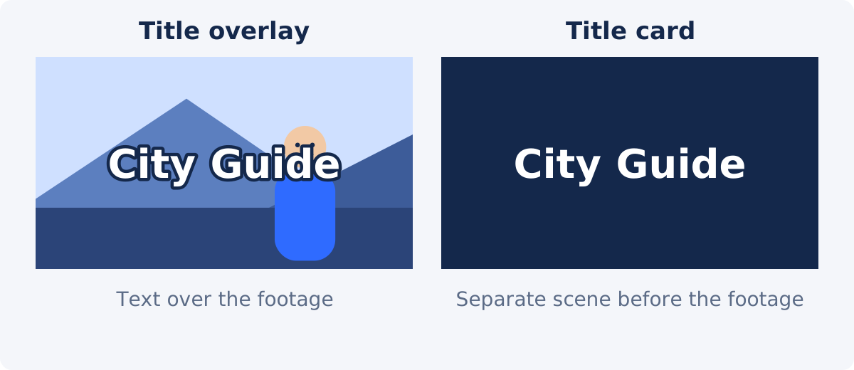
A title overlay is text placed over the footage while the video plays. The viewer sees the scene and title together. It keeps the video moving and suits social clips, tutorials, vlogs, and interviews.
A title card is a separate scene, usually a plain or designed background with the title on it, shown before the footage begins. It adds length to the video, and it is a piece of editing, because a new scene has to be created and joined to the rest.
The Add Text to Video tool creates overlays. It adds text layers to the video you upload and does not insert new scenes or build an animated intro. If your footage starts with a calm shot, such as a sky, a wall, or a slow establishing view, an overlay on those first seconds gives much of the feel of a title card. For a true title card or an animated opening, use the full Deus.Video editor.
A short title hierarchy
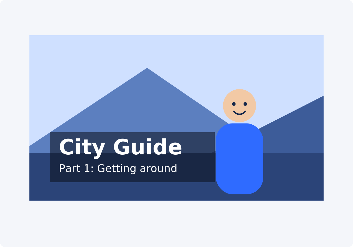
Hierarchy means showing which text matters most through size, weight, and position. A title sequence rarely needs more than three levels.
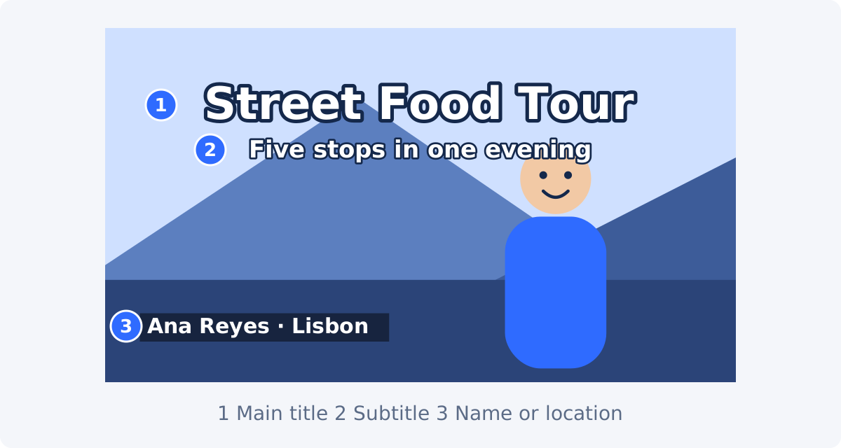
- Main title. The name of the video or section. Two to six words. The largest text on screen.
- Subtitle. One supporting line: the episode, the promise, or the date. Clearly smaller than the main title, often around half its size. This is a second line of title text, not subtitles in the sense of captions for speech.
- Name or location. A small label that identifies a speaker or a place, usually lower in the frame and later in the video.
In the tool, each text layer has one font, one size, and one color. A text layer is a separate piece of text with its own settings. Different styles cannot be mixed inside a single layer, so build the hierarchy from several layers: one for the main title, one for the subtitle, and one for each name or location label.
How to add a title in Deus.Video
Use the Add Text to Video tool to add a title or label to a video you have already exported or recorded.
- Upload the video. Common formats such as MP4, MOV, AVI, WebM, and MKV are accepted. If the video starts with footage you do not need, trim it first, so the title lands on the right opening shot.
- Select the sample text layer that appears in the preview, or use it as your first layer.
- Click the Title preset under Quick presets. It sets a 52-point white font on a semi-transparent black box with a light shadow, and it replaces the layer's wording with the placeholder "Big title," so apply it before you type.
- Type your wording in the Text field. Wording is entered by hand. Nothing is generated from the video.
- Set Font and Font size. The size field accepts values from 12 to 160, and the Title preset starts at 52.
- Drag the title into position in the preview. The corner handles resize the layer's frame. They do not change the size of the letters, which is set in Font size.
- Choose how the title separates from the footage: a background box, an outline, a shadow, or a combination.
- Set Start and End. For an opening title, Start is usually 0:00.
- For a subtitle line, type new wording and click Add text to create another layer. Style and place it under the main title.
When everything looks right, play the preview, click Add text to video to process the file, and download the result.

The Title preset and manual styling
The panel offers three Quick presets, and each one fills in a group of style fields at once.
- Title: font size 52, white text, a black box at 0.38 opacity with a box border width of 10, and a shadow offset of 2 on both axes.
- Caption: font size 42, white text, a black box at 0.46 opacity with a box border width of 8, and the same shadow.
- Label: font size 28, white text, a dark navy box at 0.8 opacity with a box border width of 6, and no shadow.
Each preset also replaces the wording of the selected layer with a placeholder, such as "Big title." Apply the preset first and type your own text afterward. A preset is a shortcut, not a finished design. After applying it, check the values against your own footage, because a preset cannot know whether your opening shot is bright, dark, or busy. A 0.38 box that works over a dim street may be too light over a white sky.
Manual styling uses the same fields the preset fills in. For a title, the ones that matter most are Font, Font size, Text color, and the three separation tools described below.
Position, size, box, outline, shadow, and timing
Position
Drag the layer in the preview. The two classic title positions are the center of the frame, for a bold opening, and the lower left, for a calmer, editorial look. The Current status block in the panel shows the active layer's position and size, which helps when you want two layers to line up.
Size
A main title should be readable within a second on a phone. As a starting point, try a font size that makes the title span between half and three quarters of the frame width, then check it in the preview. Long titles force small text, which is one more reason to keep the wording short.
Background box
A background box is a filled rectangle behind the text. Switch Box to On, choose a Box color, and set Box opacity. A dark box at partial opacity keeps the footage visible while giving the letters a steady surface. Box border width controls how far the box extends around the text.
Outline and shadow
An outline is a line drawn around each letter. In the tool, it is set with Border width and Border color. A shadow is a soft copy of the text offset behind it, set with Shadow X, Shadow Y, Shadow color, and Shadow opacity. Both help the title hold up when parts of the background are close to the text color. Use a thin outline. A thick one fills in the gaps inside letters.
Timing
Start and End set when the layer is visible. The tool does not calculate reading time for you. A workable rule: read the title aloud slowly, twice, and use that duration. For most short titles, that comes to three to five seconds. The title appears and disappears as a cut, without a fade.
Safe placement and checking different frames
The safe area is the central part of the frame where text is unlikely to be cropped or hidden by an app's interface. Platforms place buttons, captions, and progress bars over the edges of a video, and those layouts differ between platforms and change over time. The tool does not mark safe zones, so keep titles away from the edges as a habit, and check how your target platform displays a test upload if placement is critical.
Footage also changes under the title. A title that starts over a dark wall may end over a bright window if the camera moves.
- Move the playhead to the title's Start time and look at the text.
- Move to the middle of its range, then to the End time.
- At each point, check contrast, and check that the title does not cover a face, a product, or an existing caption.
- If one frame fails, add a box, move the title, or shorten its range.
Title types at a glance
| Title purpose | Length | Placement | Timing note |
|---|---|---|---|
| Opening title of a video | 2–6 words | Center, or lower left over a calm opening shot | From 0:00; long enough to read twice |
| Subtitle line under the title | Up to about 8 words | Directly under the main title, same alignment | Same range as the main title, or starting a moment later |
| Section or chapter heading | 1–4 words | Same position every time | At the first frame of the new section; 2–3 seconds |
| Speaker name and role | Name plus a short role | Lower left or lower right, clear of the face | Shortly after the person first speaks; 3–5 seconds |
| Location or date | 1–4 words | A lower corner, small | At the start of the scene; 2–4 seconds |
| Closing title or call to action | 2–6 words | Center | During the last seconds; until the video ends |
Common mistakes
Long copy
A title is not a sentence. "How I Completely Reorganized My Small Home Office on a Budget" will not fit at a readable size. "Home Office Makeover" will. Move the detail into the subtitle line or into the video description.
Low contrast
White text over a bright sky and dark text over a night scene both disappear. Choose a text color that opposes the footage, then add a box, an outline, or a shadow for the frames where the footage changes.
Edge placement
Text that touches the frame edge looks cut off, and may actually be cut off in another layout. Leave a visible margin on every side.
Insufficient reading time
Creators know their own title, so one second feels long enough. For a first-time viewer, it is not. Test on someone who has not seen the video, or use the read-aloud-twice rule.
Too many styles
Three fonts and four colors in one opening look unplanned. Use one font family, one or two sizes, and one accent color.
Title fighting the subject
If the opening shot is a face, a centered title covers it. Move the title to a lower third, or let the shot play for a second before the title appears.
If your title is a logo or a designed graphic, place it as an image with Add Image to Video instead of rebuilding it from text.
Conclusion
A good title is short, large, and steady. Decide whether an overlay is enough or you need a real title card, build a simple hierarchy from separate layers, and give the text a box, an outline, or a shadow so it survives changing footage. Check the first, middle, and last frame of its range, and keep it on screen long enough for a first-time viewer.
Ready to title your video? Open the Add Text to Video tool, apply the Title preset, and adjust the wording, style, and timing before you download.
Frequently asked questions
Can the tool create a separate title card before my video starts?
No. It places text layers over the video you upload and does not add new scenes. For a title on a plain background before the footage, build the opening in the full editor, or start your video with a calm shot and place the title over it.
Can I animate the title?
Not in the standalone tool. Text layers appear at their Start time and disappear at their End time without motion or fades. The full editor has text effects and keyframe animation.
How long should a title stay on screen?
Long enough to read it twice at a relaxed pace. For a short title, that is usually three to five seconds. The tool does not calculate this, so set Start and End yourself and test with a fresh viewer.
Can the main title and the subtitle line have different sizes?
Yes, as separate layers. Each layer has one font, size, and color. Create one layer for the main title and another for the subtitle line, and position them together.
What is the largest font size?
The Font size field accepts values from 12 to 160. Note that in this tool the corner handles resize the layer's frame and leave the letter size unchanged, so use the field to make the text bigger. If the title still does not fit, shorten the wording.
Which font should I use for a title?
Pick a clear, sturdy typeface from the Font list and avoid thin or decorative styles for small text. If a chosen font is not available during processing, Arial is used as the fallback, so review the downloaded video to confirm the look.